YouTube has been subjected to many changes in the recent days. You would find the videos shared by your Google+ connections on YouTube and the new player has of course become common. I recently cam across the new home page of YouTube. Though it has not yet been announced, we’ve got a video and some screenshots of the new home page, which I personally feel is a better one. I’m not sure when they will be rolling it out to everyone, but you can watch a teaser at the end of the post.

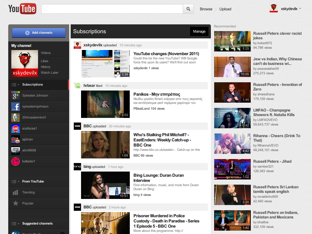
The new design has your Google+ and Facebook profile links on the left with a few channels too. Trending and Popular links are placed right below that. Your subscriptions appear at the center of the home page which shows videos from the channels you have subscribed to. The recommended videos appear on the right. This is something I wanted 😉 The featured videos appear below the recommended ones.
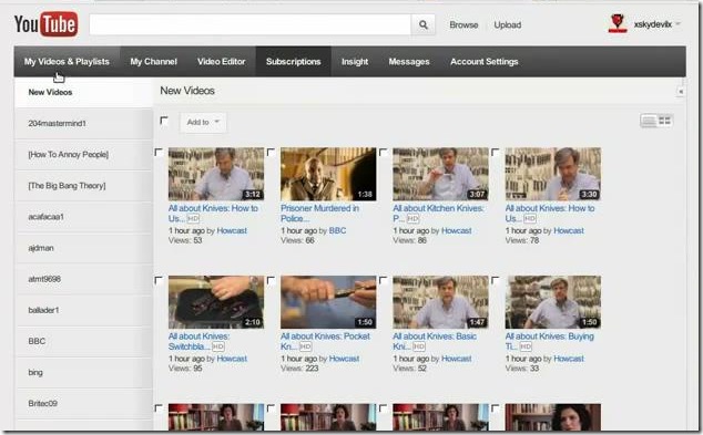
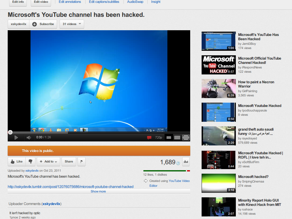
To manage your subscriptions, when you click on “Manage”, the only thing that has changed is the navigation which has a black background. The like, dislike and Add To buttons would be heavier as you can see in the screenshot below. The flash player also has three icons which let you view the video in small player, large player and in full screen.
You would see the new design only if you are able to access YouTube as http://www.youtube.com/guide/ Here is a video by Sylvester Michael Johnson which shows you the new YouTube in Action.
Remarkable changes to take place in YouTube these days. We’ll keep you updated with any future changes that could be expected in YouTube.

