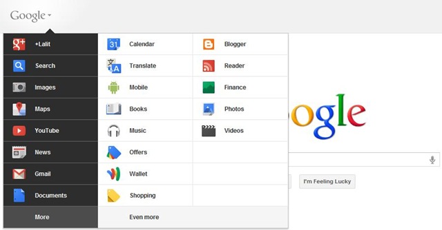
The new Google Bar has been shown up in Google’s Official Blog but it has not been released to anyone yet. As per the new design, the black bar will be replaced with a gray one. On the left, the Google logo contains a drop-down menu with links to Google services that displays when you hover over or click on it. The central area contains a search box for the Google service you are currently using. The right side features a share box and notifications to participate on Google+ from any Google page.
Here are a few screenshots of the new Google Bar:

