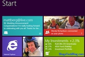
 It had not been long since I had just started using Windows 7 and i really liked it features an UI. But Microsoft again has a new version of Windows, named as Windows 8. A few hours ago, Windows President Steven Sinofsky had just demonstrated the public prototypes of Windows 8 at the D9 conference in southern California. Quite excited you must be just like me 😉 Here is a sneak peak of the Windows 8.
Windows 8 has been designed to suit both touchscreen and a traditional desktop interface. Must of its design is similar to the Windows Phone 7. Reason is obvious as the team involved in the design of Windows Phone 7 was also involved in the design of Windows 8.
The biggest change in Windows 8 is that the start menu has been replaced by the start page. The start page would be a series of tiles which would link to different apps just like how you have in Windows Phone 7. These apps are customizable too. From these tiles you can directly launch full screen HTML-5 powered apps, switch between them, move them aside and view other tiles on the side as well. One of those tiles would link to a traditional Windows Desktop and another one leads you to the store. Isn’t it quite similar to Apple linking to iTunes on the desktop? You would get live updates from the Apps on your desktop through these tiles.
The navigation through these apps is fast and fluid. You can navigate between apps by just moving the current app towards the right or you can also swipe in new apps as you wish. You can either use the app in full screen or you can adjust the size of these apps with just a finger moving on them.
The traditional desktop can also be used along with the new interface. There is a file system just like how you have in Windows 7 through which you can access your files. You can also access your apps from any other app too. This makes the User Interface more user-friendly. For more details, you can refer the video below.
The release date has not yet been revealed though it has been confirmed that it will be out only by 2012 (a long wait 🙁 )
I would love to use Windows 8, more likely due to the tiles kind of start screen which is much better than icons. What do you say? Icons or tiles?
